
Detail's on the testing engine booklet development
I had developed the booklet about the testing engines for "Technikon". The booklet was based on the layout i've designed and also have made the post-production of the 3D render's which i was curating during the building process.
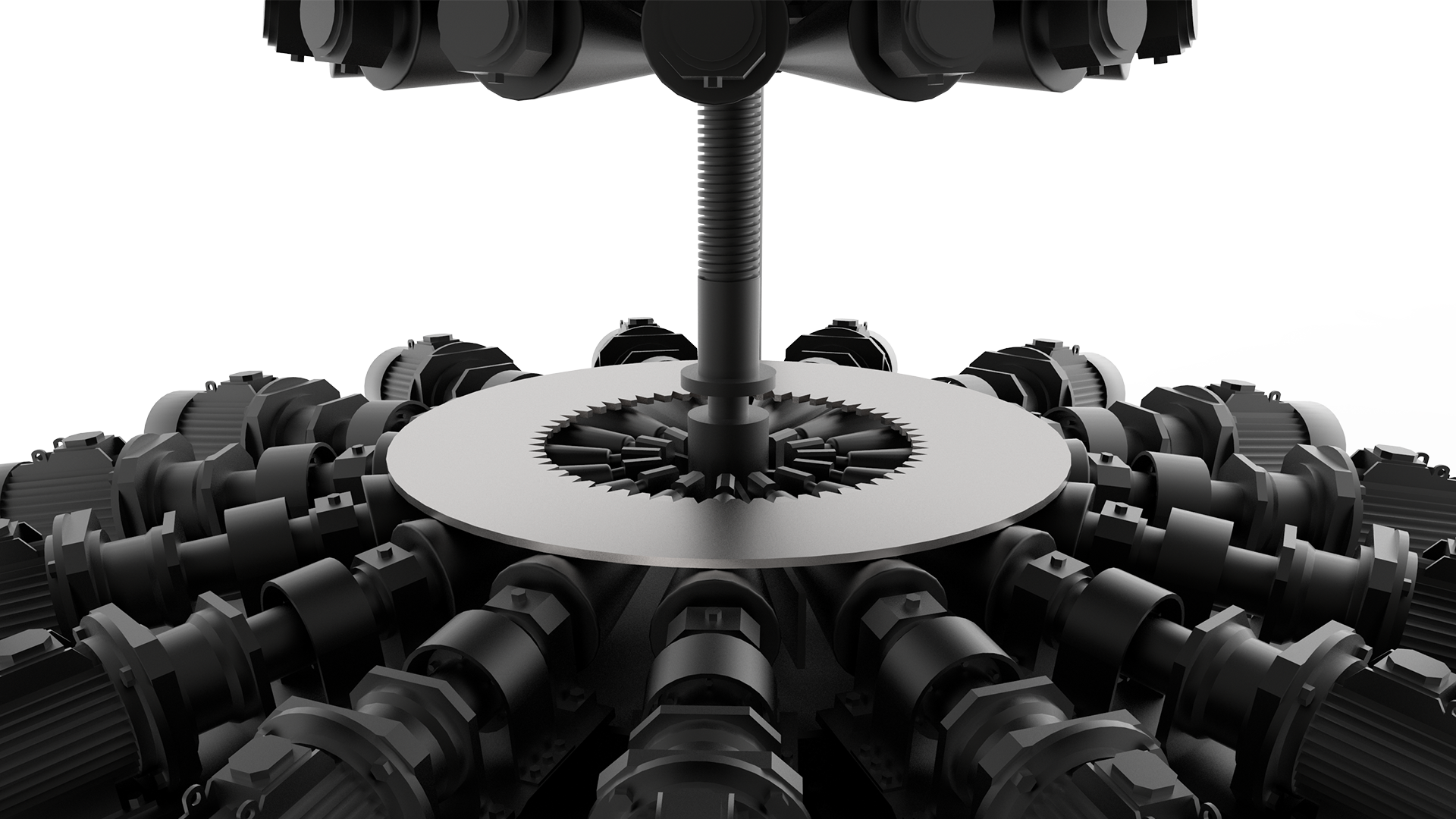
During my design process on the testing engines booklet i was faced with some interesting problem's to solve, which i wanted to share.
The first problem i faced was, that the actual root content was very rough and i needed to develop a new way of presenting a very difficult information for more broad masses. You can see the full booklet in my "works" section.

I wanted to develop a new view of the technology, showing beauty in something very specific and which was not designed for the showing it's part's for masses .I had some additional artworks to be designed for specific processes such as specific testing engines Recuperation process.
You can see below bottom left the root scheme i was requested to design in more modern way. The idea was to show the same process but from another perspective with additional details and some accent's which could make for viewer some aspect's of the technology more clear. And in back you can see 3D rendered map of the same scheme but in more clear and modern way and also with more beauty in actual detail's of the process.
The next difficult part was to create a scheme showing the PID control in a clear visual way but also to play around and do not focus on exact formula. The problem was that the actual formula was to heavy to display in booklet and i was thinking to create a diagram showing the actual process in more dynamic way. In the end the client liked more classic way of representation of PID control formula.
In the end of the design process for that booklet i realised that there is always a big depth in the creativity which we can achieve if we will dig enough for that. Further in the booklet i developed the idea of the clear and balanced way of presenting difficult object's.
“Good design is obvious. Great design is transparent.” – Joe Sparano”
Self Logo redesign
During my Master course in IED Firenze i developed a new idea on my old logo
During my Master course in IED Firenze i developed a new idea on my old logo which consisted of my first character's in 3 main languages of my life : N ( Latin ) M ( Belarusian ) H ( Cyrillic's )
I went further and developed a new combination of my logo, which show's the flexibility of design industry today and that this is my main tagline in design process from many year's.

Old logo represent's the structure but i thought that it's not enough for my representation and went further to create a universal form and set of rule's to make the logo work with limitless ways of creativity.
I decided to look at my logo from another perspective, so i rotated it to another angle and it show's me the possibility to make another perception's of the combination's could be made.
Then i moved more the blocks of the square and part's which could show something interesting.
"six of one, half a dozen of the other + 1"

As the result i created the logo, which show's the exact point of a perfect design - transformation and flexibility.
Peggy Guggenheim Collection Venice app design concept
I was participating during my Master Course in IED Firenze at design contest for the new application design related to the Peggy Guggenheim Collection museum, which is located in Venice, Italy.
I was participating during my Master Course in IED Firenze at design contest for the new application design related to the Peggy Guggenheim Collection museum, which is located in Venice, Italy. The concept was developed in collaboration with Laura Lezcano Guzman, Gianluca Governi, Francesca Fanfani and Giuseppe Tano. I was responsible for the UI design and the visual style representation of the IOS application.
My daily blog
AND SOME PROJECT DEVELOPMENT
''Among competing hypotheses, the one with the fewest assumptions should be selected.'' William of Ockham