
TE Website for Technikon
This is a small story about the a not finalized concept of the Website for the side product of Technikon company, made few years ago which i forgot to post about, but had some story to share & which was interesting to approach with.
This is a small story about a concept of the Website for the side product of Technikon company, made few years ago which i forgot to post about, but had some story to share & which was interesting to approach with.
The concept was tight bounded with the Published concept of the Brochure for testing mechanical engines made in a large scale.
So far this concept was to integrate also a vision of a web presence when launch of rebranded product presentation will be made.
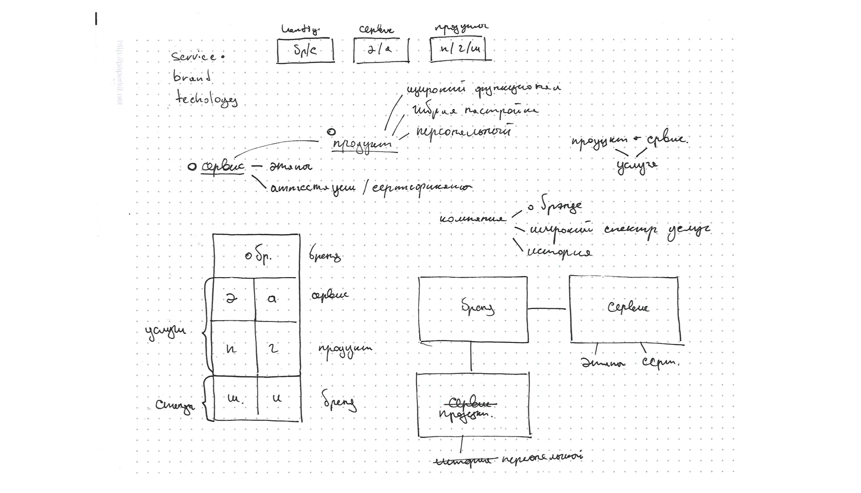
The brief was quite open so i just went trough different concepts which i abandoned during preparation of print materials.
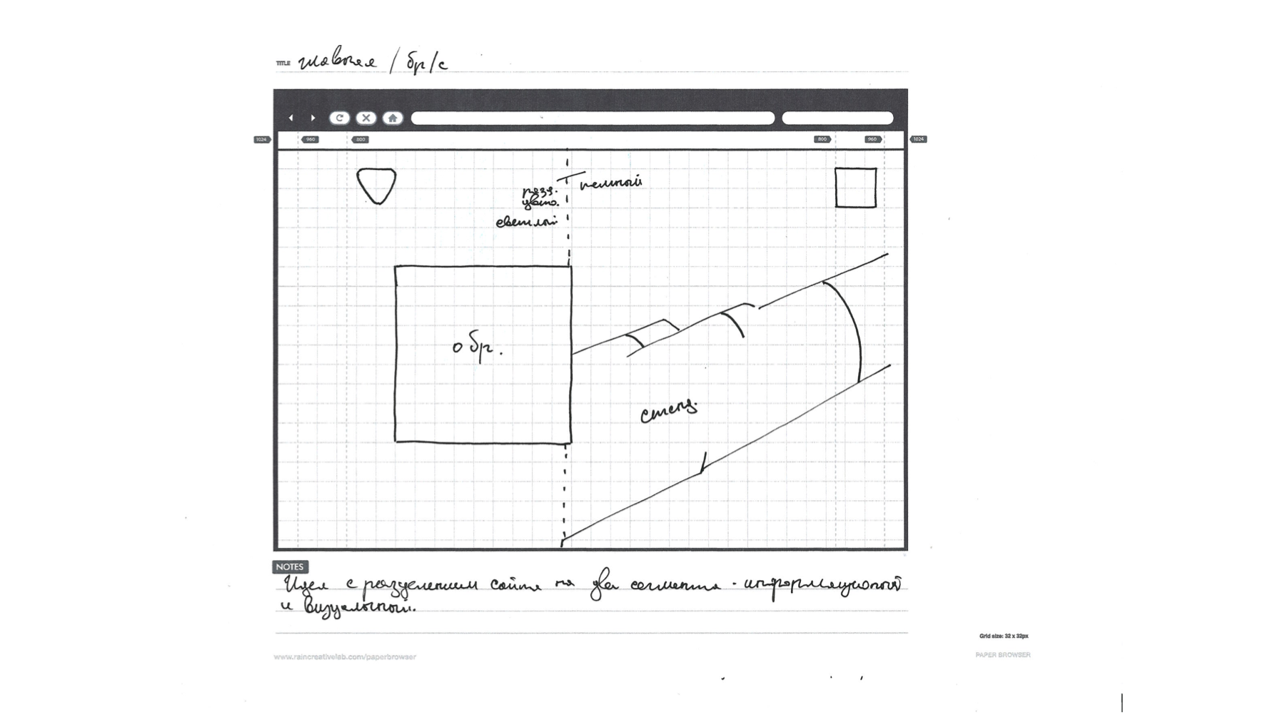
This are the first initial sketches made due to the brainstorming stage
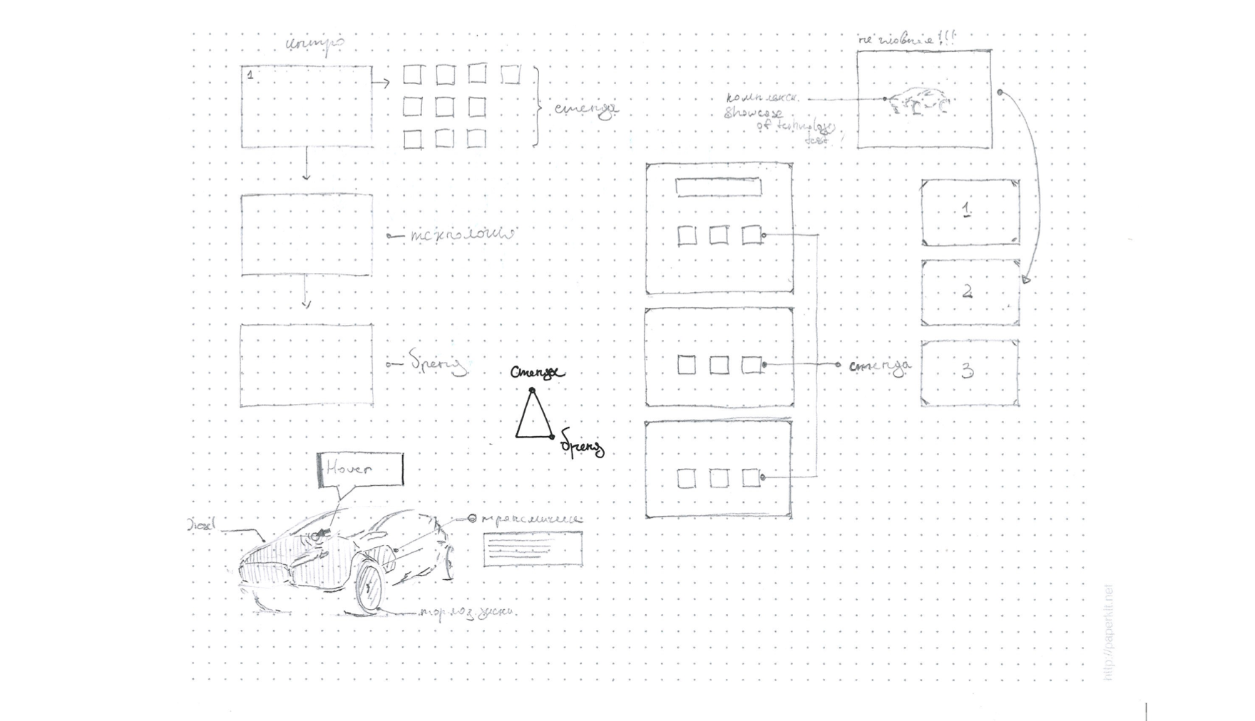
After i've distilled the basic architecture based on mindmaps and structure breakdowns by content provided, i moved to another stage of wireframing. First sketches were still made on paper with markdowns of ideas made on research stage to see how it can look in web requirements.
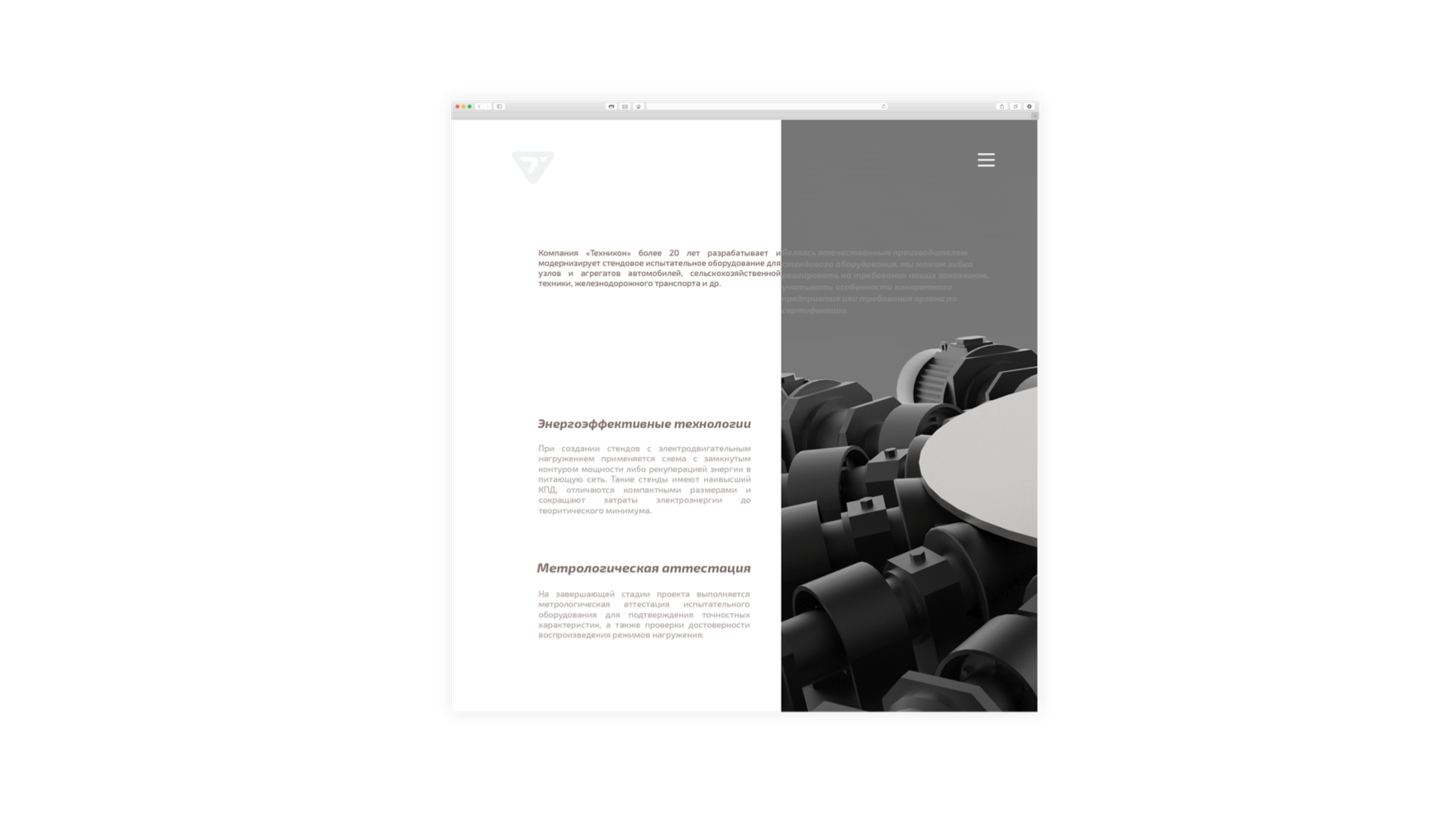
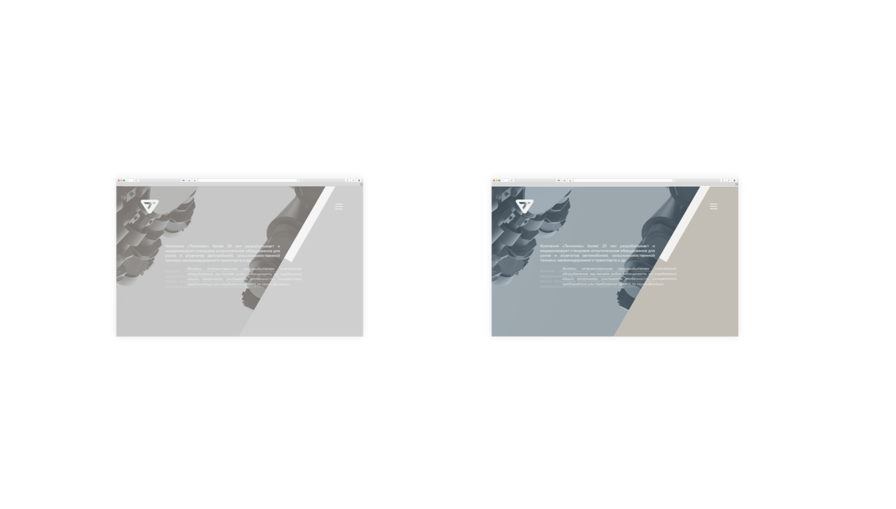
Then i tried to implement the first pitch concept in digital to move closer to real prototype.
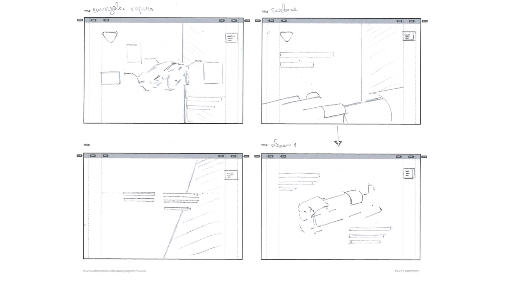
On that stage i've made a feedback session with the client showing the real concept 1, after discussion we decided to experiment with the content legibility and visual balance of white and colored spaces.
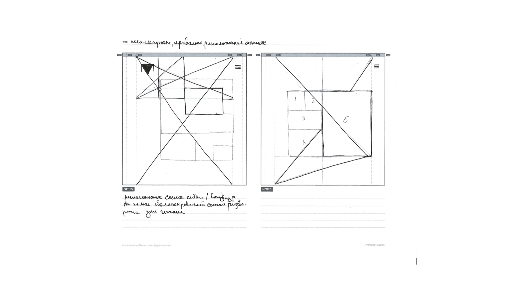
2 round of wireframing on paper and after that conversion to prototype.
The concept was rejected due to lack of content high point delievery to client ( seems to abstract )
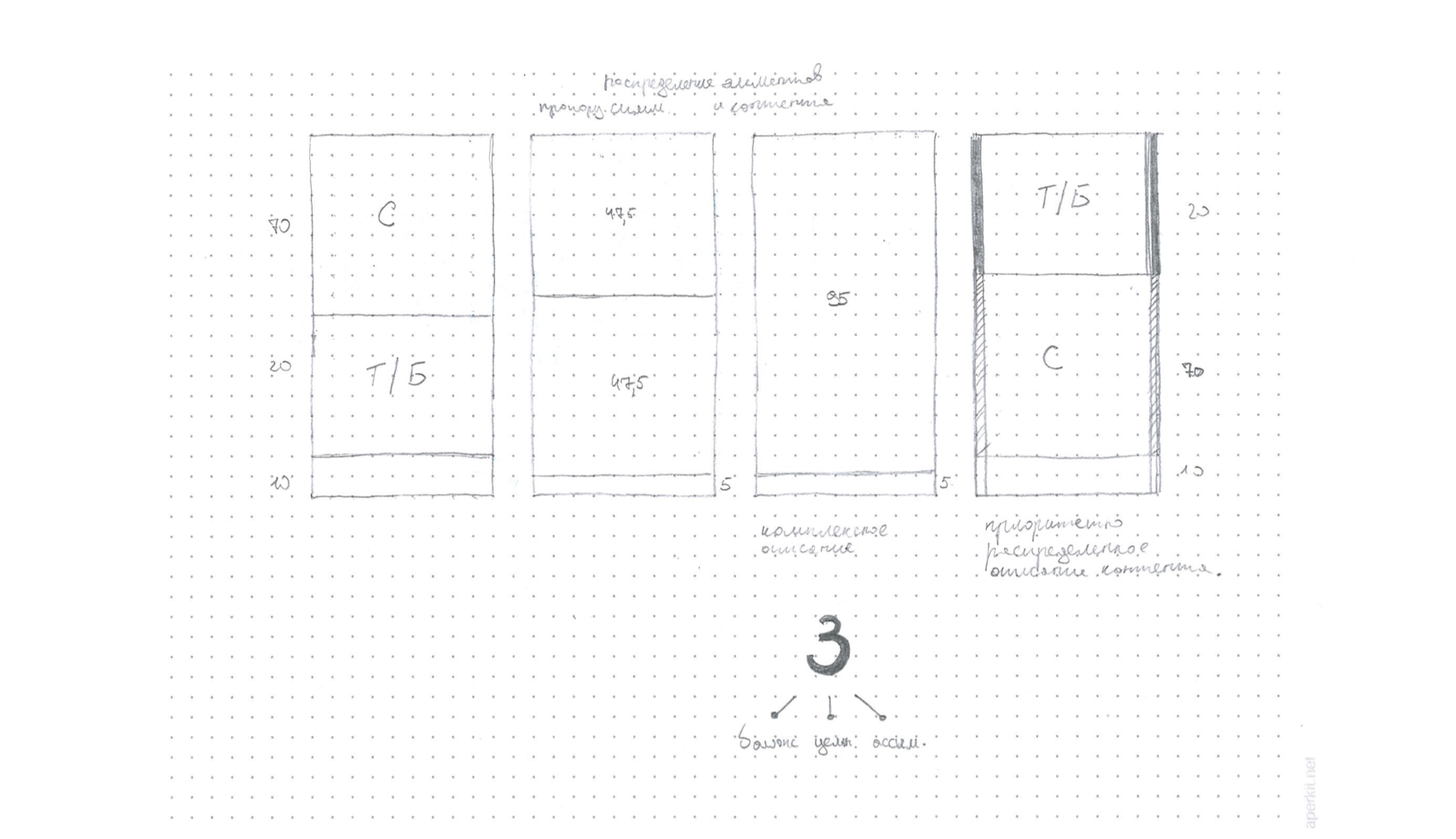
Conceptual analysis of how the content can be showed in more condensed and faster way trough visual hierarchy.
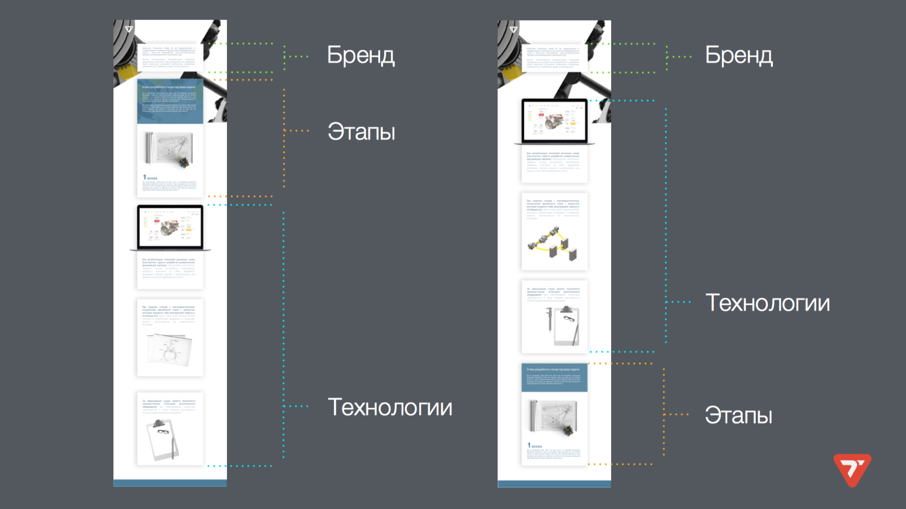
Then i've proposed a structure with the order of content provided, giving client choice of how it can be presented.
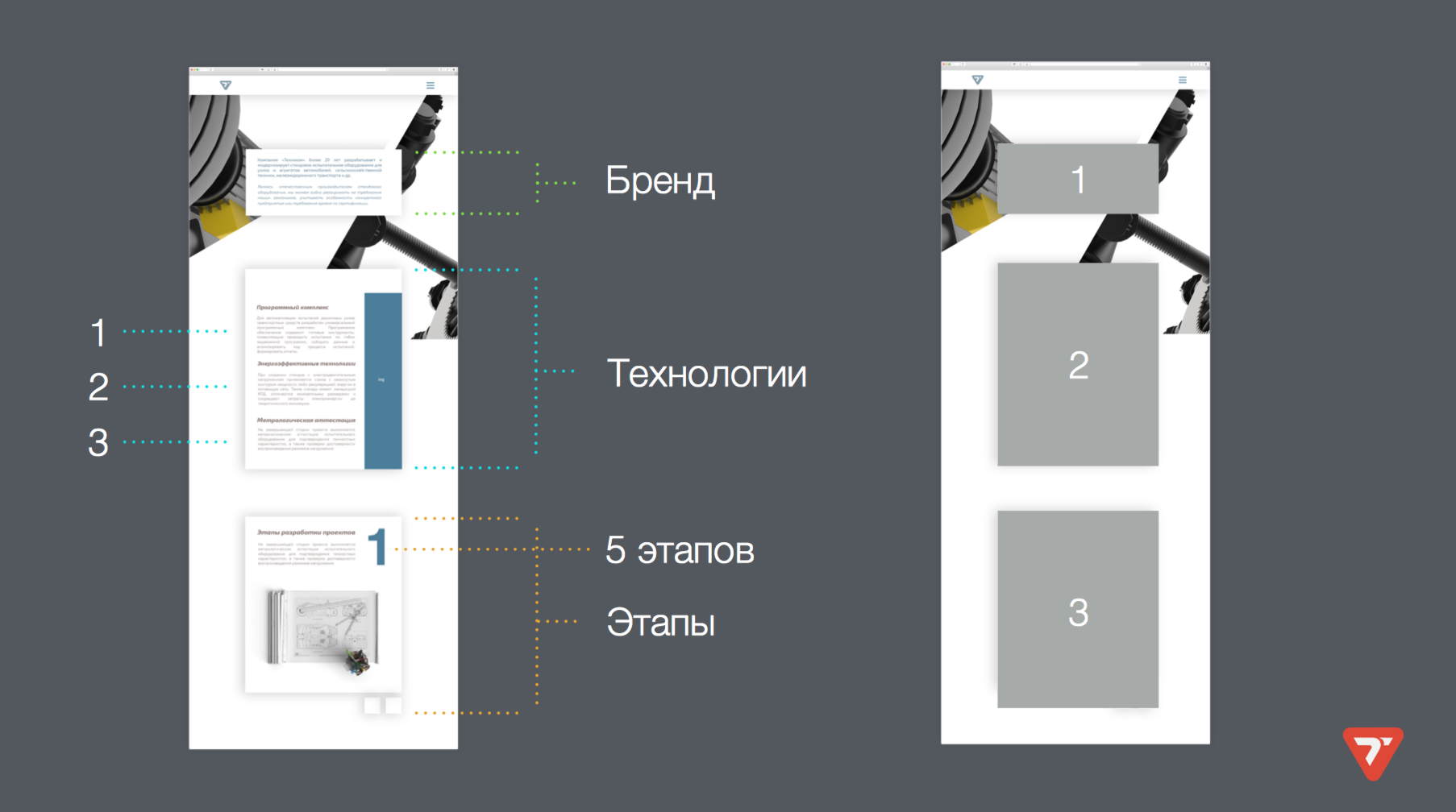
3 Option for hiearchy.
In the end it ended up to no final decision by client, either he was not sure he wants to invest to that development for particular product launch.
What i really liked and it seemed for me interesting is that i've made a deep research on the theme and also investigated different options for solving a problems and creating the final outcome which can serve to customer on specific field of business.
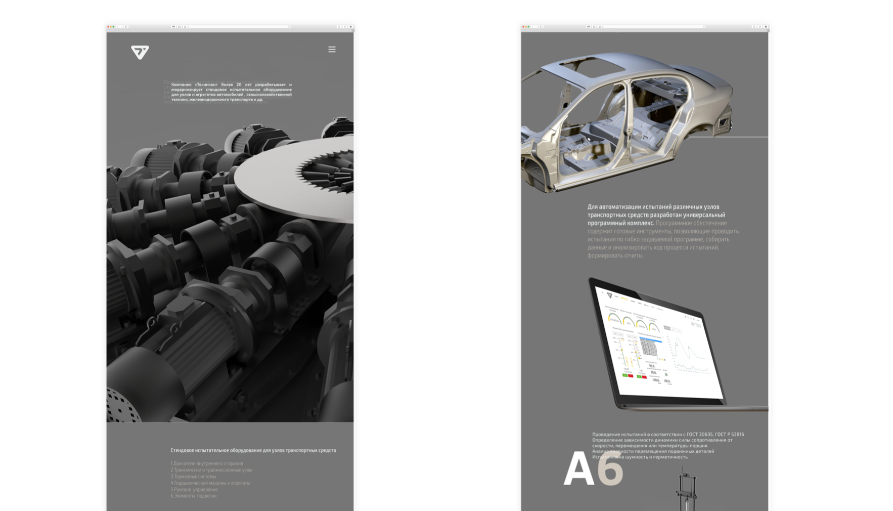
Interface for testing engines controling process application
Interface for testing engines controling process application which was created for Technikon, engineering company based in Belarus, Minsk. A partner of Mitsubishi Electronic's in Belarus.
During my development of the interface for testing engines application for Technikon engineering company, i was requested to redesign old interface of SCADA data controlling system.
During my research of the old wireframes from previous application tool's, i made a plan to create a more fluid and more simplified interface which will not loose any usability but will become more intuitive and easy to access. The application work's for analyzing the diesel engines for heavy truck's and is aimed to give a statistic's on the actuall sustainability of each element and also to test the engine's in heavy condition's.
I was creating each element in interface with more clarified intuitive visibility of every element or interactive tool.
I was working on each element of the interface separately, to clarify that the usability will work clear and also i was looking at the balance. Below you can see that the position's of each interactive tagline or the button work's the space proportionally and for better visibility relating to the nearby element. I think that in user interface design the understanding of the content is crucial, so then you can eliminate useless decoration's and work on clarifying the important part's. Also during this project i was always consulting with the programming department and the engineering department to create a really working well application for professional's and also for newcomer's to the industry.
For the section of monitoring the status of each element in testing engine i had a scheme ( see below ) which i found difficult to understand, but i made my own research on each element with help of the main engineer of testing stand. And i decided to show the status of each element in more clear way - 3D. So i rendered the diesel engine and used the image as the map with highlighting the critical status by the masking function with red or orange status.
As the result the set of the screen's was a starting point for the full redesign of all supporting application's from the Technikon company.
Detail's on the testing engine booklet development
I had developed the booklet about the testing engines for "Technikon". The booklet was based on the layout i've designed and also have made the post-production of the 3D render's which i was curating during the building process.
During my design process on the testing engines booklet i was faced with some interesting problem's to solve, which i wanted to share.
The first problem i faced was, that the actual root content was very rough and i needed to develop a new way of presenting a very difficult information for more broad masses. You can see the full booklet in my "works" section.

I wanted to develop a new view of the technology, showing beauty in something very specific and which was not designed for the showing it's part's for masses .I had some additional artworks to be designed for specific processes such as specific testing engines Recuperation process.
You can see below bottom left the root scheme i was requested to design in more modern way. The idea was to show the same process but from another perspective with additional details and some accent's which could make for viewer some aspect's of the technology more clear. And in back you can see 3D rendered map of the same scheme but in more clear and modern way and also with more beauty in actual detail's of the process.
The next difficult part was to create a scheme showing the PID control in a clear visual way but also to play around and do not focus on exact formula. The problem was that the actual formula was to heavy to display in booklet and i was thinking to create a diagram showing the actual process in more dynamic way. In the end the client liked more classic way of representation of PID control formula.
In the end of the design process for that booklet i realised that there is always a big depth in the creativity which we can achieve if we will dig enough for that. Further in the booklet i developed the idea of the clear and balanced way of presenting difficult object's.
“Good design is obvious. Great design is transparent.” – Joe Sparano”
Self Logo redesign
During my Master course in IED Firenze i developed a new idea on my old logo
During my Master course in IED Firenze i developed a new idea on my old logo which consisted of my first character's in 3 main languages of my life : N ( Latin ) M ( Belarusian ) H ( Cyrillic's )
I went further and developed a new combination of my logo, which show's the flexibility of design industry today and that this is my main tagline in design process from many year's.
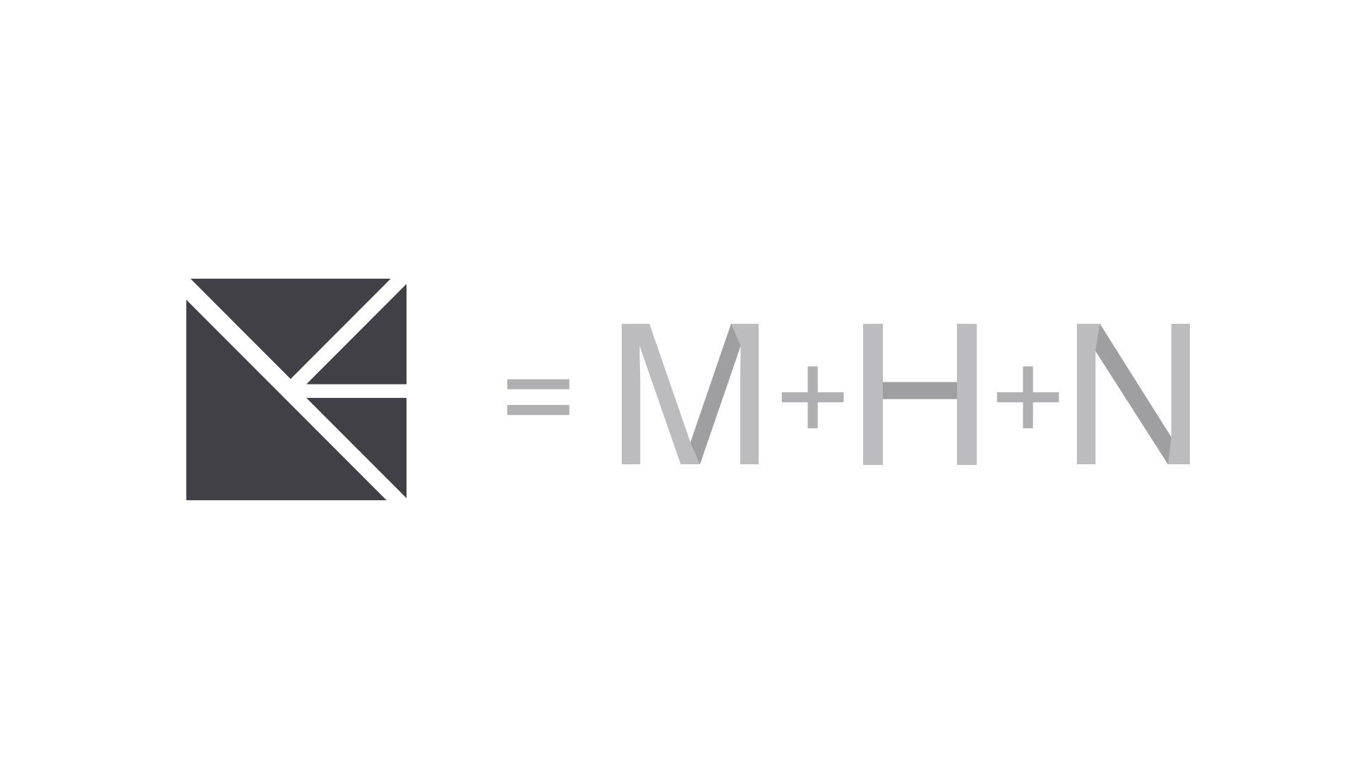
Old logo represent's the structure but i thought that it's not enough for my representation and went further to create a universal form and set of rule's to make the logo work with limitless ways of creativity.
I decided to look at my logo from another perspective, so i rotated it to another angle and it show's me the possibility to make another perception's of the combination's could be made.
Then i moved more the blocks of the square and part's which could show something interesting.
"six of one, half a dozen of the other + 1"
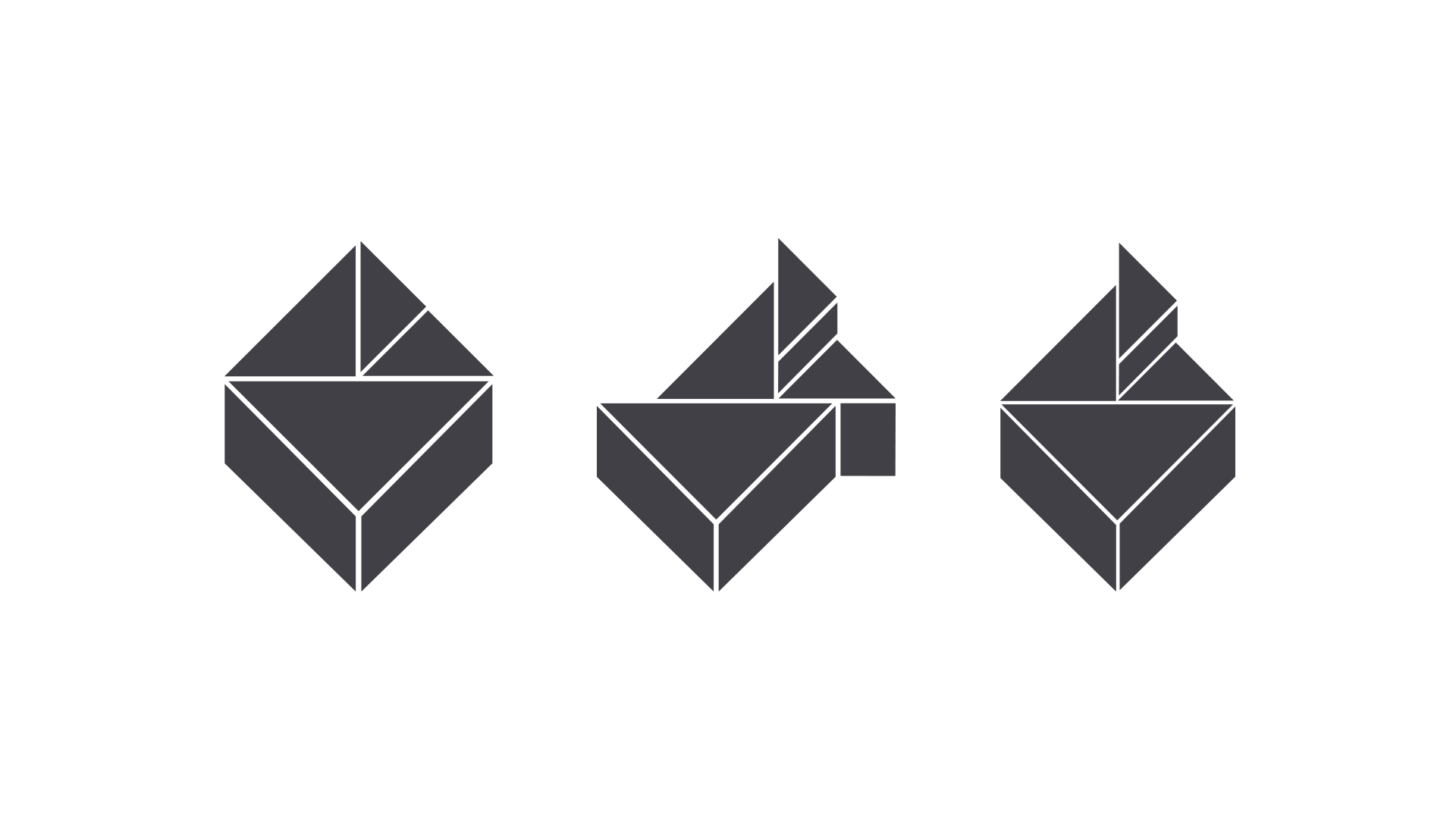
As the result i created the logo, which show's the exact point of a perfect design - transformation and flexibility.
Wargaming / Naliboki catering collaboration outfit design
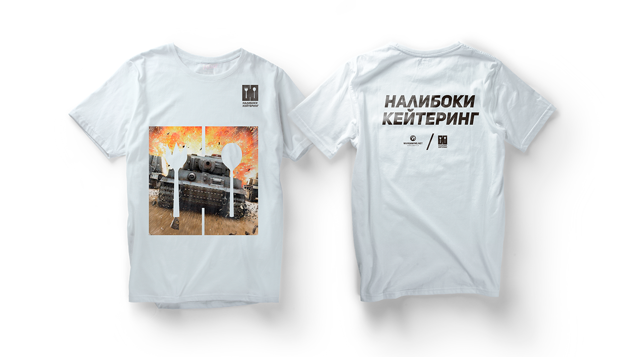
I made a thematic design of a t-shirt for the "Naliboki Catering" related to the upcoming big event at "Wargaming" office in Minsk, the biggest Belarusian game developer.
I made a thematic design of a t-shirt for the "Naliboki Catering" related to the upcoming big event at "Wargaming" office in Minsk, the biggest Belarusian game developer, which made such games like : World of Tanks and World of Warships The idea was to combine the theme of the main title of Wargaming ( World Of Tanks ) and the branding frame of "Naliboki Catering".
My daily blog
AND SOME PROJECT DEVELOPMENT
''Among competing hypotheses, the one with the fewest assumptions should be selected.'' William of Ockham